Minimalism has quickly become a buzzword in designing spaces not just in homes but in classrooms, as well. More educators are seeing the value of transitioning to this style as it benefits students. With surroundings free of visual and physical clutter, kids can focus better on the lessons and tasks at hand. With the simplicity of furniture and decor in the room, children enjoy a calm learning space.
While the minimalist classroom sounds simple to pull off, it becomes a little complicated when simplicity borders monotony. This is the dilemma of many teachers: how can you go minimalist without the space looking flat and boring?
Try using these design tips below to pull it off:
Let furniture take the spotlight.
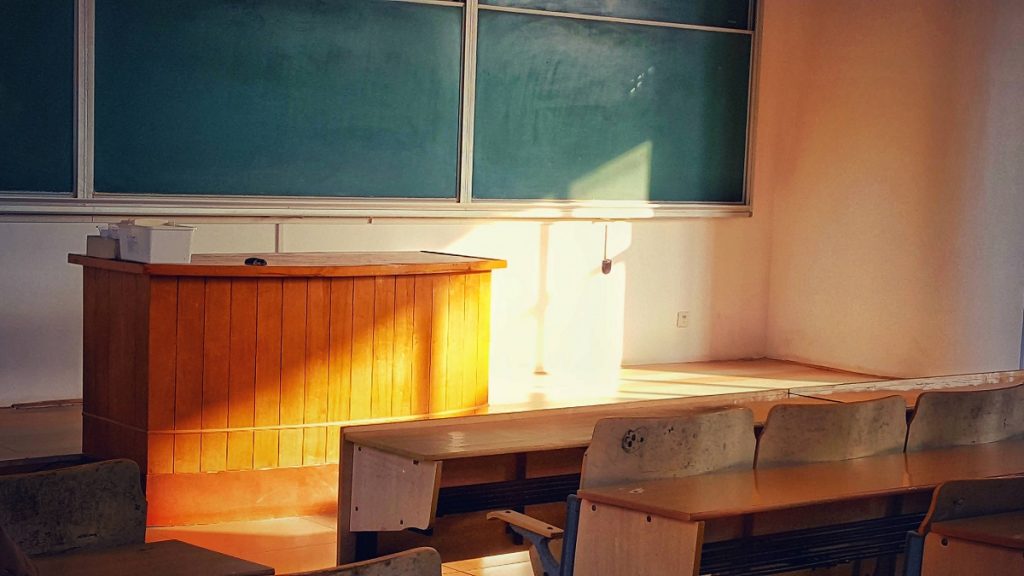
The reason minimalist spaces can afford to be at their simplest and cleanest is that they’re centred on the idea of necessity. Only the essential things remain. By extension, this means everything in the space serves a purpose and not just a visual display. Most of the things in minimalist spaces have a variety of uses.
For instance, there is seating furniture which doesn’t only have built-in desks but also comes with storage. Besides being multi-purpose, such furniture pieces are flexible. You can fold or reconfigure them in different ways, accommodating various needs or saving floor space. Modern classroom furniture in Australia doesn’t only create a simple, neat design but also improves the visual appeal of the space, as the versatility of the pieces takes centre stage.
Choose the right colours.

In minimalism, neutrals are the most common. Black, white, beige and grey are popular choices. Yet, they don’t exactly make for visually enticing colours for young students. The trick here is to make neutrals your base and introduce bright hues as accents. If you want to do away with neutrals, blues and greens are your next minimalist choices. Pick lighter shades to achieve the clean, simple look. Keep in mind that bolder colours can be significant distractions among students.
As you pick colours, don’t forget to incorporate different textures: wood, stone and metal. A good balance in these materials can give depth to the toned-down hues you chose.
Declutter.
While you’re only adding the essentials, you should remove those that aren’t. In short, declutter. Classrooms can quickly pile up with so many items, from paper-mache volcano projects and solar system dioramas to Van Gogh-inspired artworks to different learning displays, such as multiplication table charts and alphabet cards. Teacher’s desks are likewise filled to the brim. Too much stuff isn’t only an eyesore. They could also affect the learning of your students, as they find it difficult to concentrate in the classroom.
Let the students take their projects home or keep them in cabinets or bins. Go through your drawers, and consider what you use and need. Go to every wall in the room and evaluate which displays you can do without. Declutter weekly to reduce the likelihood of things piling up. With your room spotless and clean, your design will shine, and would, therefore, avoid that dull, monotonous look.
Is it time to switch to a minimalist design? Consider the value of going simple and clean in your classroom. It may just be the learning haven your students badly need.